
Your guide to publishing on the University website
Content promo banners
Content promo banners are used to link to a story or another page. There are several display options shown below.
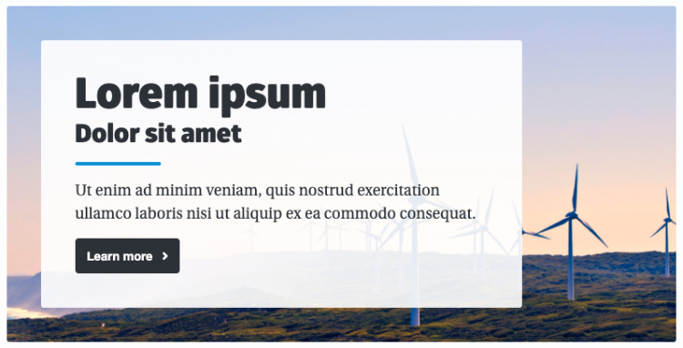
Regular
For pages with a left-hand menu.
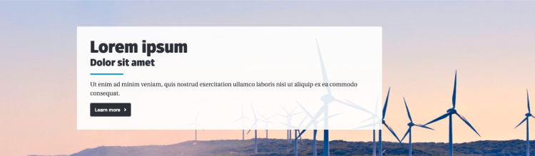
Full width
This is for one-column pages. The banner spans the width of the page/the user's browser.
Parallax
For one-column pages. The image scrolls at a different speed to the other content.
Quick checklist
- A link to a story or page
- Image (if for a promotion, optional if the banner is being used as a navigational tool)
- 1150px x 250px (for one column pages: full-width and parallax)
- 720px x 270px (for pages with menu: regular).
Add component
1. Navigate to the standard page you wish this promo banner to live on.
2. Right click on your standard page in the asset tree and select content.
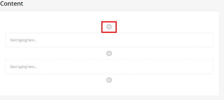
3. Once on the content screen, select the plus icon:
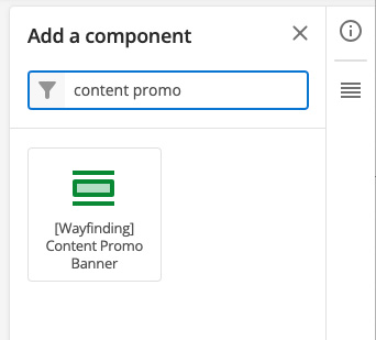
4. In the pop up search for “content promo banner” and select the corresponding component.
Add content
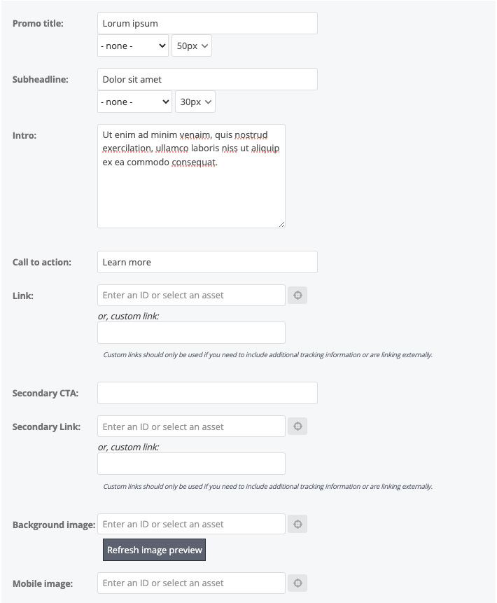
5. Fill in the following fields:
- Promo title
- Subheadline (optional)
- Intro (optional)
- Call to action
- Link
You can also highlight a word in blue by selecting it on the drop-down menu next to the title or subheadline fields.
6. Add Image (the image must be uploaded to Squiz prior to this)
Style the banner
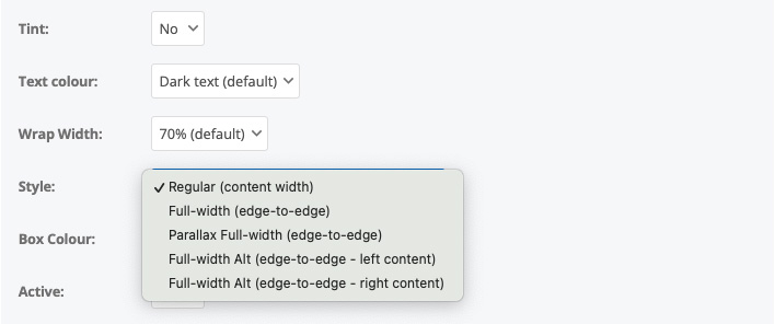
7. Adjust the settings: Add a tint or coloured box around the text, change the text colour and size if needed. This is also where the style can be selected:
The wrap width determines how far across the image the text is displayed. Eg if the width is set to 60%, the text will display across 60% of the image.
NOTE: The banner must be active for it to be visible on a live page.
8. Save and preview.
The University of Newcastle acknowledges the traditional custodians of the lands within our footprint areas: Awabakal, Darkinjung, Biripai, Worimi, Wonnarua, and Eora Nations. We also pay respect to the wisdom of our Elders past and present.